While this may be old news to some of those in the photographic community, Adobe has released the long awaited Adobe Lightroom 2. I won’t bore you or repeat what others are saying as I’m sure by now, there have been a flood of great discussions and reviews on the subject by such people as Scott Kelby of Photoshop Insider and a long list of new features from Victoria Bampton. But I do have to say, this new release is fantastic!

I completed the upgrade about two hours ago and everything went very smoothly. Of course I was careful to back things up first, but there were no problems that I’ve found yet! It’s really too early for me to give an exhaustive review, but right off the bat there are a few very noticeable improvements in the Library module.
My Impressions

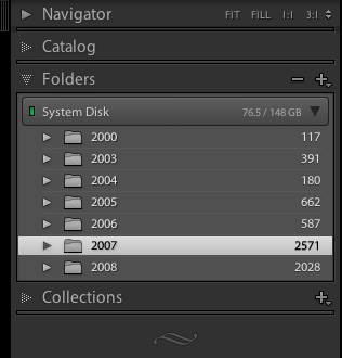
The first is the fix I was truly waiting for with regards to storing photos on removable media. Since I do most of my photo organizing work on my MacBook, I really don’t want to clog up the laptop drive with all the photos I’ve ever taken. Especially now that I’m shooting more for stock where I take a lot of photos of the same thing. These have no value on my laptop as they aren’t something I’d want with me on a daily basis. Adobe has created a solution to this problem by updating their Folders tab in the left navigation pane to show which volume has the photos. The small green light next to the volume name means that the volume is currently attached to the computer. If I had photos on another volume which were in this catalog, and the volume were disconnected, the light would be red. This update also allows for the user to see a user selectable statistic on this line as well. Right-clicking on the volume line allows the user to select between Disk Space, Photo Count, Status or None. The status statistic simply displays whether or not the volume is online. I find this somewhat redundant as the user can already tell this by the red/green light. Photo count shows the number of photos in the current catalog, but for my uses, this isn’t really all that important. Therefore, I’ve chosen to have it display disk usage. Your mileage may vary.

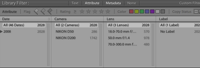
The other improved feature is the filtering capabilities. While Lightroom 1.4 had most of these filtering abilities, the improved user interface (at the top of the thumbnail viewer) is great. It’s much easier for me to filter on what I want quickly and with less fuss. Also, it allows the saving of preset filters — a real plus for me as I like to use color codes for different types of photographs. Using a preset filter, I can quickly and easily find all photos tagged with the red color tag (my stock photo color) with a rating of 4 or more stars. Taking it a step further, I can save the above preset with certain keywords (such as ‘Microstock’ and ‘Needs Uploading’) and I can find all stock photos with a rating of four or more stars which needs to be uploaded to microstock websites. Now that’s helpful!
Conclusion
While I still have a lot of investigation and learning (I was not one of the Beta Testers), thus far, I’m very impressed! I’ll probably continue to update as I figure out more of the new features — especially in the develop modes.